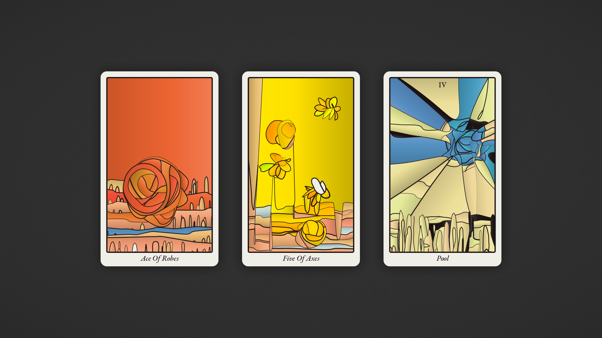
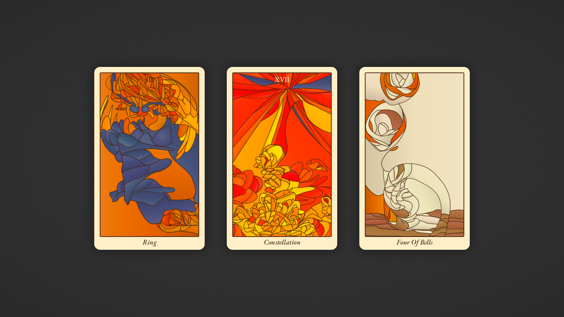
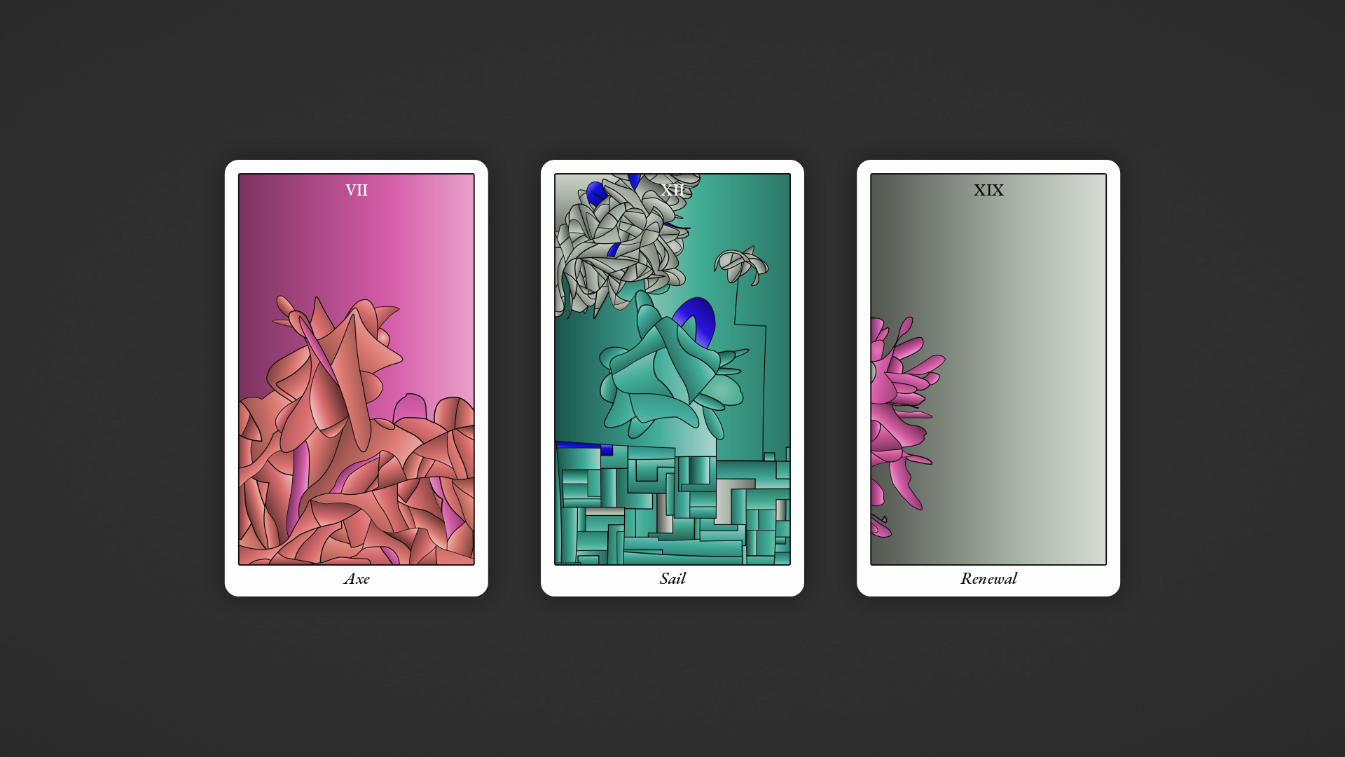
Procgen Tarot
This generator was created for the summer PROCJAM 2018.
It is now possible to save individual cards as SVG files. Right click to open the context menu with all the options.
Hot keys:
- Click any card or press ENTER to get a new spread
- SPACE - toggle 3-card spread / single card
- F - toggle visibility of filled shapes
- O - toggle visibility of outline
- B - toggle visibility of background
- 1 - RWS style
- 2 - Visconti-Sforza style
- 3 - "Gobelin" style
- 4 - Wildwood style
- ~ - random style
Comments
Log in with itch.io to leave a comment.
i got ace of BEANS. that makes me happy...beans :3
The art direction is really nice it lacks a gameplay aspect, text or simply accompaniment though
This looks really interesting. I'm a bit confused about the styles tho. There doesn't seem to be much difference, except when choosing "random style", the lines seem to become thinner.
If different styles look the same then something is wrong - they supposed to use different colour schemes, stroke thickness, gradients, maybe something else. Also, "random style" should look differently every time you choose it.
Absolutely stunning
interesting !
so thats how proc generated poetry looks like :)
OMG that’s so cool, I would have loved to print some cards and try them out!
GRAPHICALLY BEAUTIFUL. This looks well done.
There appears to be a bug - sometimes one or two areas on a card don't get colored in. I was able to fix this by commenting out
if(duplicate) { return null; }
inside the register(shape) function in Painter. So the problem is with how it detects duplicates.
OK, I've fixed the bug 3 different ways and I think what's happening is that occasionally one region entirely contains another. The function register(shape) only checks whether an existing region has points outside the shape, not whether the new shape has points outside an existing region. Comparing the sizes of the two regions can show them to be not duplicates (and skips a lot of comparisons), or the comparison can be done symmetrically to notice that shape contains points outside the existing region.
I don't know if you'll ever come back to this, either to do a writeup or add to it, but it is quite wonderful! Sometimes I can just sort of sink into the image and see figures and detail. Here are the improvements that came to mind while I was playing with it.
It could use some more suit names. They're probably easy to come up with, but here are some I've seen on real decks: discs, mirrors, spirals, doors, chalices. And some from the short story "Dowager of Bees": chains, bees, ivy, scissors, chimneys, teeth.
I'd like it if some decks used "princess, prince" in place of "page, knight". Other face cards in actual decks include "brother, sister, mother, father". Again referencing Dowager of Bees, we have titles like "Dowager, Detective." It would be nicely surreal to have a wide variety of titles like that.
All that's just word-stuff, but with the images it feels sillier to suggest anything. One nice touch would be using textures other than gradients on some decks, as if the printing techniques vary. And the lines could be slightly offset from the colors, as is often seen on older or cheaper printings of RWS decks. Also, the style of the numbering and lettering could change from one deck to another; some decks could have a "borderless" style.
My personal temptation would be to add a few exceptions to many of the predictable rules, for example sometimes "six of swords" could be generated via the face card / major arcana generation algorithm.
Hey! Thanks for your tips for improvement!
Yeah, I should have been less conservative about suit names, I will add more of them. I haven't read Dowager of Bees, probably I should...
Unusual face cards are interesting, but in contrast with suit names I can't mix them freely. "Swords, Pentacles, Doors, Chimneys" is OK. "Page, Knight, Dowager, Detective", not so much. So my only option (without complicating everything) is to have a number of predefined sets, which is not very exciting.
Using textures instead of gradients is technically harder. Not much (not like impossible, of course), but harder. As for numbering/lettering I don't know why it's not implemented. I was sure I'd added different fonts and occasional all caps style.
If you are interested in the topic (tarot+procgen) you might like "Parrigues Taror" by Emily Short - no images, but lots of beautiful text descriptions :)
I was able to download the Javascript source and get it working, and added more text to my own liking. :) I see what you mean with the gradients; it's just enough to be a bit annoying to add texture. It looks like you've got a framework in place for alternate lettering, but the "modern" style is the only one implemented.
If you don't mind, here's my current understanding of how your image generation works - how close am I to correct?
So each card has a number of objects associated with it, such as "sea", "sun", "star", "figure", "mountains", "city" etc. These objects work in different ways but generally have an actual position on the card, and often an associated "mask" that determines the shape of their "density". Objects also have a flow field, which I take it is like a vector field, which influences the direction lines will take, if the line is associated with the object. Each object also has a set of parameters which determine how lines will be drawn; this can make lines strictly follow the flow field, or wobble around, or travel at right angles to the flow field, or zigzag, etc. etc. It can also make lines thicker or thinner, and can apply certain colors to the cells which are produced by the lines.
Drawing takes place via a number of growth points traveling around on the card. Each of these growth points belongs to one of the "objects" (as I've been calling them), but they're all on the same card so they can collide with lines being drawn by other "objects". One thing I'm not clear on, is how many growth points initially are placed onto the card. Do separate objects maintain separate pools of points, or are they all thrown in together? But anyway, just like with the famous "Substrate", when a growth point collides with an existing line, it gets moved someplace else on the card.
As I understand it, growth points actually spread outward in two directions (unlike Substrate). So I think maybe both sides of the line need to "land" on an existing line before the line "dies" and a new growth point gets placed. When both sides of a line have "landed", typically it would form a closed shape which I think gets called a "cell". I'm guessing that the growth point which completes a "cell" influences what color it eventually gets colored, via the parent object that owns the growth point.
New growth points get placed randomly on the card, according to the "density" field. Looks like when a new growth point is placed, it drains away some of the density nearby, so that growth points are unlikely to begin too close to where one has already been. There's also a limited number of total growth points, so that eventually they run out and the card is finished.
I think that covers most of what I understood. Is that about right?
Been poking around all day, and now I have some coherent thoughts on improving the image generation.
The pips have some good variety, but at the moment aren’t different enough that, e.g., diamonds and chimes can be told apart by shape in a given deck.
An easy way to vary them more would be to alter their “density” or starting number of seeds. I’ve cranked up the seeds and gotten an interesting look.
Very occasionally, I get a suit whose pips favor some zigzag lines. I got a “rocks” suit on one deck which was a grey color and did this! It looked like jagged boulders. Possibly this outcome should be slightly more common to increase variety.
I suppose mask shapes could also be varied more. Thin, randomly tilted rectangles, crescent shapes, or annuli (circles with a hole) might look noticeably different, but I haven’t tried any of that.
A more out-there idea would be to add a “foreshortening” effect to either the line quality or the flow fields. Right now, flow fields have “right” and “left” which are at right angles from their forward direction. But these “right” and “left” vectors could be placed at shallower angles to the forward vector, with “right” still being the negative of “left”. Applying foreshortening could potentially make some objects seem more 3D. And, flow fields could potentially have different amounts of foreshortening in different regions. (At this point it’s almost like having two different flow fields, one conceptualized as at a right angle to the other.) This means they could represent the geometry of foreshortened curved surfaces.
Besides the pips, the other major thing to my mind is the figures. Sometimes they turn out very interesting, but they have some quirks which can feel repetitive; such as not having a clear head or being roughly diamond-shaped. What I’ve done for myself is add some extra mask shapes, such as just the top half of an ellipse, and a plain rectangle. The plain rectangle doesn’t look too great, but maybe more random quadrilaterals would have some character. I was also thinking maybe a more hand-shaped human silhouette could be good, or a selection of appropriate Julia sets.
I’d also like to try and see what happens when all the density is placed near the edges of the mask shape, leaving the middle basically empty. But another option would be to try distributing the density by Perlin noise.
When it comes to having a head, probably the only solution is to put some sort of deliberately generating head near the top of figures some of the time. Wouldn’t want to do that too much. The strength of this comes when it enables seeing things in the scribbles, not when it forces one interpretation.
Sorry to spam you with lots of messages, but I've also gotten some nice looking results by putting just a single kink into the lines - via using numbers other than pi to initialize the second tracer's angle at the end of Tracer.spawn().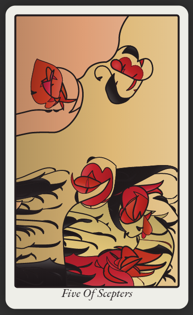
Nice!
I'm not sure (as I said it was created too long time ago) but I think I didn't like how zigzags looked. For my taste they were good for variety, but not as a frequent element.
Are you talking about specifically pips here? I think they are too small to make their shapes matter (except maybe with aces, twos and threes). But Major Arcana and face cards I would add something like random blob shapes to portrait large non-round, not-rectangular objects (including figures).
Everything sounds about right. I'm not sure about fine details as this generator was made more than two years ago.
As far as I remember, a single tracker is placed per time (or something like this). I tried to spawn all the trackers according to the density, but it looked bad: this way they didn't have chances to draw long curves because they bumped into each other too soon.
To be honest I have no idea what Substrate is. Yes, curves grow in two directions. Otherwise there would be loose ends which could cause problems with building of closed contours.
Ah, Substrate is a screensaver: https://www.youtube.com/watch?v=dCCVgBOVD0E It avoids the loose ends by starting seeds directly on existing lines. I was acting like you'd heard of it because I've seen it mentioned a couple times in the context of history of procedurally generated art. https://procedural-generation.tumblr.com/post/124657726768/substrate-2003-shortly-after-the-turn-of-the
Having played with the code more, now I understand that the objects are rendered in one at a time to give some appearance of depth. It does look like there's a setting for number of starting seeds which gets used on a few objects.
It might be interesting to produce some symmetry by having some objects which place two seeds at a time, symmetrically. Maybe that would be a solution for getting more face-like things to appear.
Anyway, I'm enjoying poking around in your old project. :)
High-res/ svg export would be amazing! You make things that inspire!
It looks like the bigger the screen, the bigger the image generated :) so maybe there is a good way to trick it into generating print-quality images
By messing with my screen settings I was able to get cards of about 749 x 1260 pixels (per card - the png images I got were bigger). That is *almost* the image size required by a POD tarot card service.
I will add svg export: these are vector images, so it shouldn't be too hard.
That would be amazing!
Any updates for svg export? Thanks in advance!
I've just implemented a universal method for converting my graphics to SVG (for Perilous Shores) so I might as well try it out on this. If everything will be OK, there will be SVG export in Procgen Tarot within a week.
SVG export is here.
Here is a trick (for Chrome): set the zoom level to 25%, click the "Enter fullscreen" button, then choose "Save image as..." in the context menu. The resulting image will 4 times larger than your on-screen image.
Wonderful!
Thank you!
This doesn't work in the itch.io browser
Could you make a downloadable/offline version of it, please?
Realy cool game, or rather the very realization that a stack of cards generated randomly (to create another stack of random cards, press on keyboard: 1, 2, 3, 4 or ~, for more information). Also I can say that in my opinion you can add. I think, to create interactivity, you can made that you need to choose cards of only one type (say the type RWS, or "Gobelin") from the three shown, until the entire deck is finished. Of course, this is my personal opinion.
(Also i noticed the eye in the upper right corner of the screen, when you select one of the cards)
Also, something I would to say to the Watabou, of course, maybe this is not the topic. But are you really Watabou? The one who created the Pixel Dungeon! It is amazing! Personally, I myself played Pixel Dungeon (and some other games that you created), and some of my friends also played Pixel Dungeon, realy cool game, also that you can play modified versions of the game. Personally, I am surprised that you are participating in jam, but I think it is really cool, thank you, through for sure I do not know why you are participating in jam, but somehow I think it is very cool.
The truth is, I would like to ask a question, but what can you advise in order to achieve your goals, or how to finish the game? Personally, this question interesting to me, because sometimes I notice that some of my games are not brought to playable version.
You can throw off useful articles if you want, I will be very grateful :)
Yes maybe the question is similar to spam, in advance i am sorry, through I can write my messages to where you will be more convenient, thanks :D
And of course many thanks to those people who finished reading to the end :)
This is really great work. I hope Spirit Navigator makes something similar. It will be awesome a merging of this technology and their tarot readings!
This is really neat! I love the way it kind of draws abstract flowers regularly, and the choices of names. Are the names procedurally generated as well as the art?
Thanks! Names are just chosen randomly from a relatively small vocabulary. The original idea was to query them from WordNet (or similar database), but that would be too much work :)
The art style is really interesting and beautiful. Btw, is it me or is the art on the cards made procedurally? :0
What would be the point that to submit it to PROCJAM otherwise? :)
I thought so, but even then, it's incredible!
Really cool!
Neat tool! Though I'm a tiny bit concerned about how the generated patterns seem to be the same for each card title. Example, the pattern on "Justice" is always the same.
Once a card of the current deck (of 78 cards) is generated it stays the same. To get a new deck refresh the page or press 1, 2, 3, 4 or ~.
Good to know, thank you!
I remember in twitter you mentioned this solution, very beautiful work @watabou!
Love this beautiful thing. Thanks a lot.